101
Designing a home is an exciting process, but it is also one where small missteps can lead to long-term frustration and unexpected costs. Whether decorating a new residence from scratch or renovating a long-time family home, homeowners often fall into predictable design traps. These errors can compromise the comfort, flow, and visual balance of a living space.
Creating a beautiful and functional interior requires a clear understanding of proportion, lighting, layout, and personal lifestyle needs. By learning to identify and avoid common decorating pitfalls, you can save time and money while designing spaces that feel cohesive, practical, and tailored to your daily life.
Neglecting Scale and Proportion
One of the most frequent interior design errors involves selecting furniture and decor that do not suit the actual dimensions of a room. Scale refers to how an object relates to the size of the room, while proportion refers to how objects relate in size to one another.
-
Oversized Furniture in Small Spaces: Placing a massive section sofa or an oversized entertainment center in a compact living room creates a cramped environment, restricting natural walking paths and overwhelming the room visually.
-
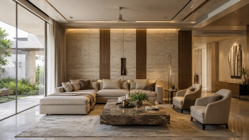
Undersized Rugs: A common mistake is buying an area rug that is too small for the seating area. An undersized rug acts like a small island, floating awkwardly in the middle of the room and making the space feel fragmented. Ideally, at least the front legs of all major furniture pieces should sit comfortably on the rug.
-
Tiny Artwork on Expansive Walls: Hanging a single small frame on a large, blank wall creates visual imbalance. Artwork should scale with the wall surface or be grouped intentionally as part of a gallery collection.
Relying on a Single Light Source
Lighting is one of the most critical elements of interior design, yet it is frequently treated as an afterthought. Many homeowners rely solely on a single overhead ceiling fixture to illuminate an entire room. This results in harsh shadows, flat visual planes, and an uninviting atmosphere.
A well-designed room utilizes a layered lighting strategy consisting of three distinct types:
-
Ambient Lighting: General illumination that replaces natural daylight, typically provided by recessed ceiling lights, flush mounts, or large central fixtures.
-
Task Lighting: Focused light sources designed for specific activities, such as desk lamps for working, under-cabinet LED strips for kitchen prep, or adjustable reading lamps next to an armchair.
-
Accent Lighting: Decorative lighting used to draw attention to architectural features, artwork, or shelving, such as wall sconces or directional spotlights.
Failing to install dimmer switches is another missed opportunity. Dimmers allow you to adjust light levels throughout the day, instantly transitioning a room from a bright functional workspace to a relaxing evening setting.
Pushing All Furniture Against the Walls
A common instinct among homeowners is to push every piece of furniture directly against the perimeter walls to maximize open floor space in the center of the room. In reality, this layout strategy often backfires, creating an awkward, sparse void in the middle of the room that hinders natural conversation.
Floating furniture away from walls encourages better traffic flow and creates intimate, functional zones within a room. Placing a sofa a few inches or feet away from the wall, backed by a slim console table, establishes a more sophisticated and intentional layout. In open-concept floor plans, floating furniture helps define distinct living, dining, and working areas without requiring physical walls.
Choosing Aesthetics Over Functionality and Comfort
It is easy to get swept up in interior design trends showcased in polished magazine spreads or social media feeds. However, selecting furniture purely based on appearance without considering everyday durability and comfort leads to regret.
A stark white velvet sofa may look stunning in a photograph, but it is rarely practical for a home with young children or pets. Similarly, dining chairs with rigid, unsupportive backs may look sculptural, but they discourage guests from lingering comfortably over a meal. Prioritize high-performance fabrics, ergonomic support, and stain-resistant finishes for high-traffic zones, reserving delicate materials for low-use areas or decorative accents.
Misjudging Artwork Placement and Hanging Heights
Hanging artwork too high is a widespread mistake that breaks the visual connection between wall decor and the surrounding furniture. Artwork is frequently hung near eye level for a standing person, which places it too high relative to seated eye level.
As a general rule, the center point of a single piece of art or a gallery arrangement should sit approximately 57 to 60 inches from the floor. When hanging art above a piece of furniture, such as a sofa, headboard, or credenza, the lower edge of the frame should sit roughly six to eight inches above the top of the furniture piece. This anchors the artwork visually to the room rather than letting it float independently on the wall.
Overdecorating and Failing to Edit
A room filled with too many patterns, accessories, furniture pieces, and souvenir displays quickly feels chaotic rather than curated. When every object demands attention, the eye has nowhere to rest, causing visual fatigue.
-
Lack of Negative Space: Negative space, or empty area on walls and countertops, gives the eye a break and allows focal pieces to stand out.
-
Cluttered Surfaces: Overcrowding coffee tables, entry consoles, and kitchen counters with small knick-knacks creates physical friction during daily routines.
-
Matching Furniture Sets: Purchasing an entire matching bedroom or living room set directly off a showroom floor deprives the home of personality. A curated interior mixes varied textures, wood tones, and eras to create a rich, layered aesthetic.
Mastering the art of editing means knowing when a room is complete. Periodically removing items that no longer serve a function or bring joy maintains a clean, intentional living environment.
Ignoring Architectural Style and Natural Light
Decorating without considering the architectural character of your home or its orientation toward natural light leads to disjointed design choices.
Attempting to force an ultra-modern, industrial aesthetic into a historic craftsman bungalow often feels unnatural. Instead, honor the home’s original architectural elements—such as trim work, exposed beams, or window casings—while integrating modern furnishings that complement those built-in features.
Additionally, test paint colors in different lighting conditions before committing to a full room. A paint swatch that looks like a warm, creamy beige in a south-facing room saturated with natural light may appear cold and gray in a north-facing space. Apply large paint samples to multiple walls and observe how the color shifts from morning to night under artificial and natural light.
Frequently Asked Questions
What is the most common mistake people make when choosing paint colors?
The most common mistake is choosing a paint color in a store under fluorescent lighting or selecting a shade based solely on a tiny paper swatch. Paint colors interact dramatically with a room’s specific lighting conditions, surrounding furnishings, and architectural orientation. Always paint large test patches on different walls in the room and observe them throughout various times of day before making a final selection.
How do I fix a room that feels disjointed and cluttered?
Fixing a disjointed room requires a thorough editing process. Begin by removing all small decorative accessories, extra pillows, and non-essential furniture. Re-evaluate the placement of major items, ensuring clear walking paths and balanced scale. Reintroduce decor selectively, grouping small items in odd numbers on trays or shelves, and ensure a cohesive color palette links the textiles and artwork together.
How can I make a low ceiling feel higher using interior design techniques?
To create the illusion of higher ceilings, hang drapery rods as close to the ceiling line or crown molding as possible and let the fabric extend all the way down to the floor. Use vertical elements like floor-to-ceiling shelving, tall floor lamps, or vertical wall paneling to draw the eye upward. Choosing low-profile furniture and painting the ceiling a crisp, reflective shade of white also opens up vertical space.
What is the ideal distance between a coffee table and a sofa?
The ideal distance between the front edge of a sofa and a coffee table is between 14 and 18 inches. This gap provides enough legroom to sit comfortably while keeping drinks, books, and remotes within easy reach from a seated position. The coffee table height should also sit level with or slightly lower than the top of the sofa seat cushions.
How do I combine different wood tones in the same room without it looking messy?
Combining wood tones successfully relies on identifying a dominant wood tone and maintaining a consistent undertone across secondary pieces. Determine whether your primary wood piece has warm, cool, or neutral undertones, then choose supporting wood elements that share that same undertone family. Spreading the different wood finishes evenly throughout the room rather than clustering one finish in a single corner maintains visual balance.
What should I consider before open-plan living room furniture layout?
Before arranging furniture in an open-plan layout, identify key traffic pathways between doorways and adjacent rooms to keep walkways clear. Use area rugs to visually anchor distinct functional zones, such as the living space, dining area, and reading nook. Position floating furniture like sofas or storage credenzas with their backs to dining or entry zones to subtly define room boundaries without constructing physical walls.
How can I make my home look high-end without spending a fortune?
Making a home look high-end involves focusing on detail, scale, and editing rather than expensive luxury items. Swap out builder-grade cabinet hardware and light switch plates for brushed metal finishes. Hang floor-length curtains on heavy-duty rods, choose oversized area rugs that fit the entire seating arrangement, ensure artwork is properly framed and hung at eye level, and eliminate surface clutter to let key furniture pieces shine.